One Sunday, a chill elbowed its way through Brooklyn and something in its biting breath told me to buy a film camera at that very moment. And so I stood, unresearched and ignorant, in front of a store associate stumbling through what I hoped to achieve with said film camera, offering descriptors like “something, low key” and “point-and-shoot” until she sagely guided me to a Pentax Espio 145M. The grip of the thing slid expertly into my palm and the zoom buzzed quietly, expanding and contracting as I toggled the button. Sold, I confronted my next dilemma. As it was a film camera, it required, well, film. I hadn’t thought that far but, upon reviewing the options on the shelf, I recognized the name “Portra 400” from the Arlo Parks song. The associate was too polite (or sinister?) to correct me when I called it “Portia 400” (too White Lotus-pilled to function) and implored that it was one of the better films for shooting people with darker skin. That was all it took.
Soon enough, the Pentax became an appendage, a part of my 2023 personality as I carried it around to parties, dinners and trips. Earlier in his career, my father had been a cinematographer and film photographer, and with every frame shot, I felt closer to him. It’s likely the closest I’ve ever felt to being a #NepoBaby.
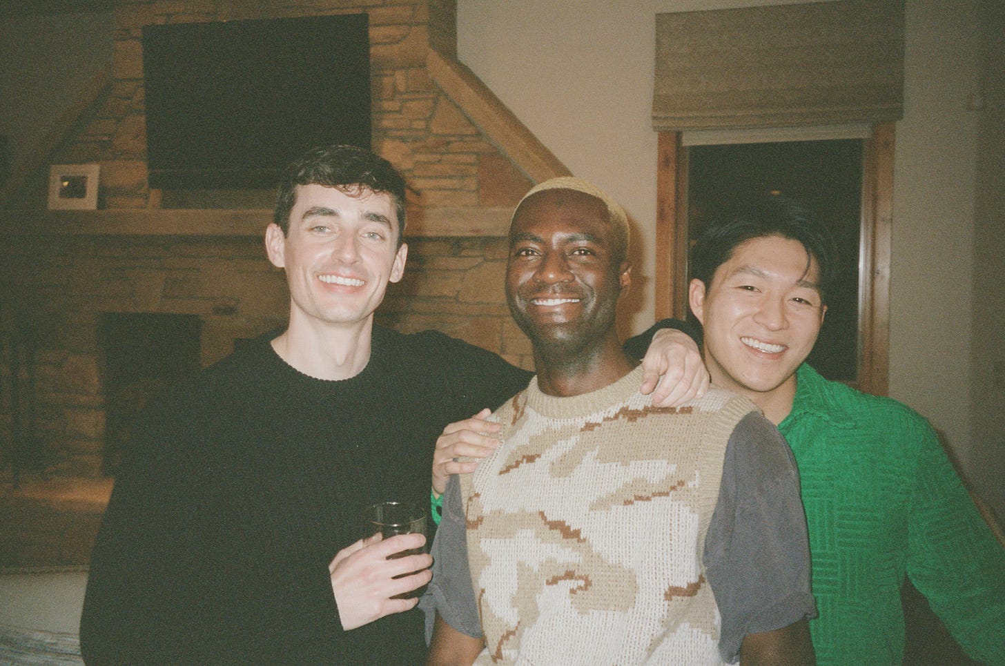
Snapping photographs on film divorces you from the immediate gratification that comes with present-day digital image-making. On my phone, I can instantly assess if I have captured something beautifully or not. And if not, I can re-take it or zhuzh it up with after effects, either lazily slapping on the Paris filter or amping it up in VSCO if I got time to waste. Correspondingly, the final output of film photography is often a mystery until your roll is developed. Despite this delayed review, I enjoyed receiving my scans a few days after dropping them off at the print house. The rolls served as a time capsule of the micro-moments that populated my weeks. And so, week after week, I sat on my couch and reviewed, saving and sharing photographs that turned out better than anticipated.
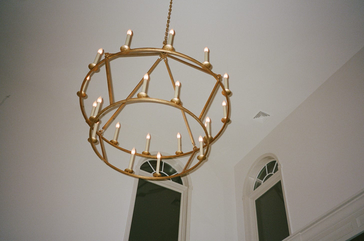
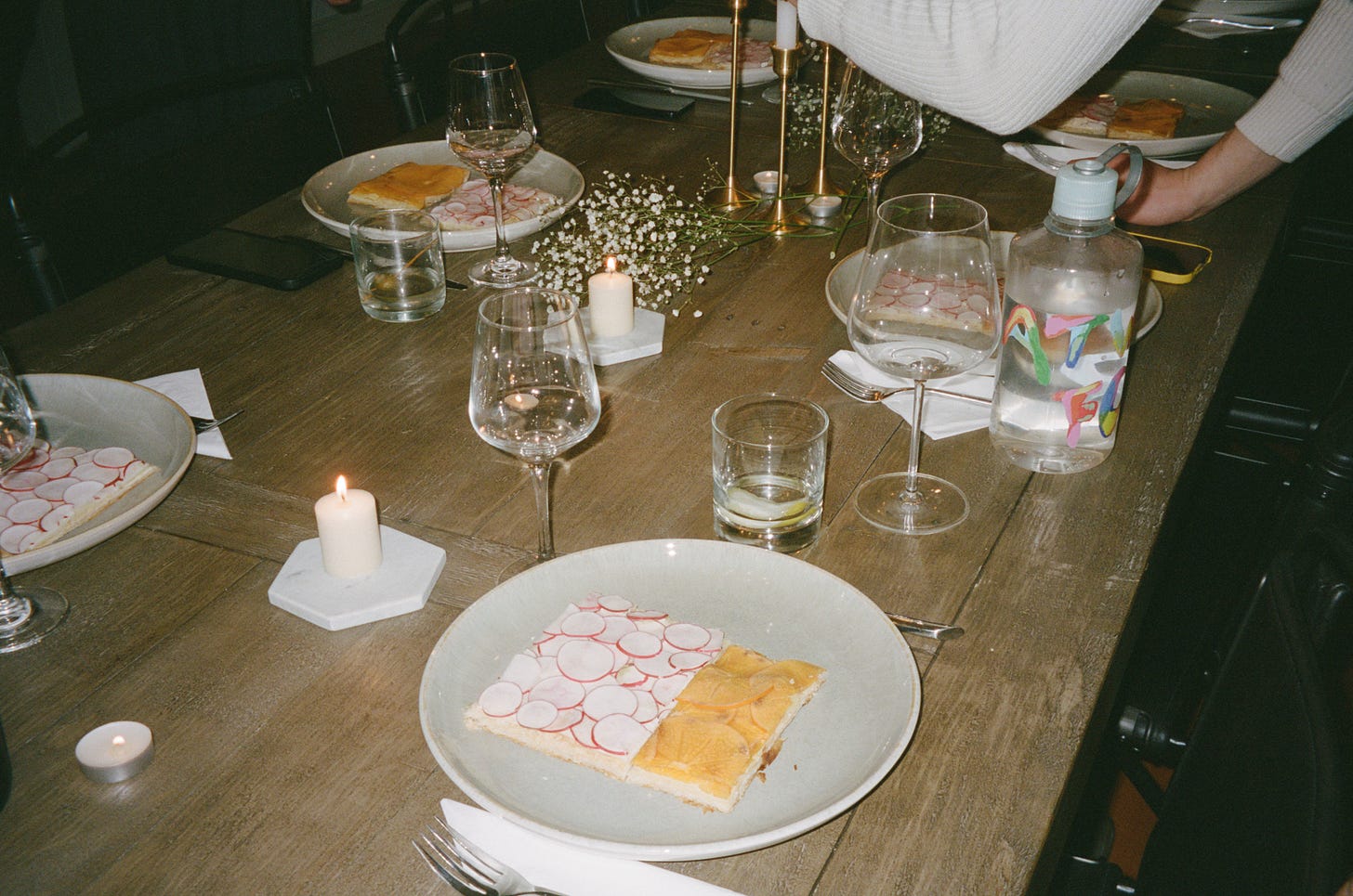
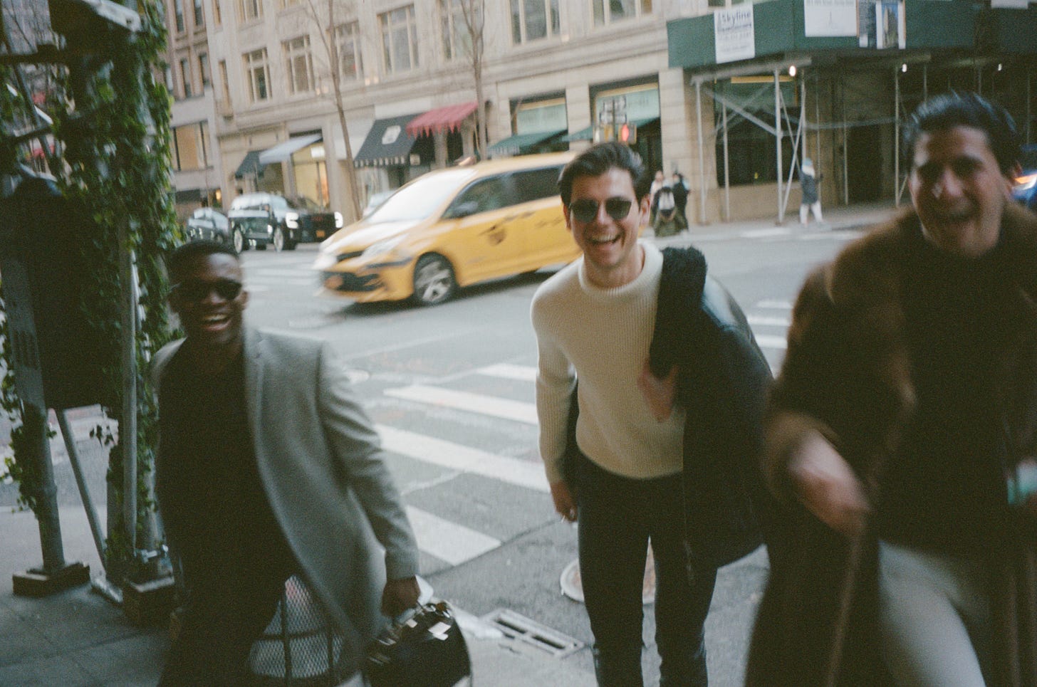
Oddly enough, I gravitated towards images that dulled my subjects in a flattening wash. Either overexposed or not exposed enough, the subjects in these photos became undone and stripped of their vitality. The gleams of their eyes were deadened while the hues of their garments became decayed. The zeal and sheen that was acutely captured through a cell phone lens (or, tbh, a more skilled photographer) became anguished on film. In the photos, my friends were relegated to mere objects with #NoFilter or lighting tricks to amputate them from their surroundings. Through the prism of the film, we were robbed of aesthetics and polish. In short, we became uglier. I kind of liked it.
Across many avenues of humanity, we’ve seen a slow movement against aesthetics. We’ve replaced glamour with rawness and swapped opulence for brutalism. One of the most prominent examples of this is how we portray ourselves online. If Instagram is known for its manicured, Millennial varnish, TikTok is the cesspool for Gen Z’s preference for authenticity over aesthetics. Instagram rose to prominence with Millennials due to its curatorial capabilities. Not only does the ‘gram allow users to filter their image (a glow-up for those who grew up in the MacBook Photo Booth generation), the whole premise of the app is to present an aspirational version of yourself. An embellished life. On TikTok, driven by Gen Z sensibilities, we’ve seemingly cast away the need for over-editorialized beauty. The content that performs best on TikTok appears to be shoddily shot and haphazardly produced. The viral videos that saturate my For You Page look as though it was captured in one take with mistakes left in. It’s as though “no aesthetic” has become its own aesthetic.
The migration from hyper-perfected visages to uncouth, raw self-expression is no more evident than in the Instagram photo dump. Don’t get it twisted, constructing a photo dump is still a curatorial act. It’s just that the dump’s seemingly frenzied construction often lacks the cohesion of a traditional IG carousel. And without visual consistency, what aesthetic can truly be identified? The best photo dumps appear as if they are casually dropped from a camera roll rather than carefully mined. Consider the following choreography:
An A24-stickered Nalgene nestled in park grass / swipe / a semi-nude mirror selfie with the juicy bits obscured by steam / swipe / a screenshot of an Ice Spice lyric annotated via Rap Genius /
…like?swipe / an off-centred selfie of you and your friend on a Mario Bellini couch that you can’t afford / swipe / an aerial view of a beef bulgogi at a hole-in-the-wall Korean joint / end swipe.
The dump in question posits a user that is hot, artsy, cultured and too cool to be concerned with construction. It eschews the self-serious stink of Instagram. It’s incoherent, scattered and, at times, unpretty. But today, overt expeditions towards prettiness are pretty cringe. Today, cringe can be pretty beautiful.
These gestures all mask a deep-seated motive for desirability through the mirage of casualness. Those who participate in this sort of image-making, whether producing a grainy film photo, an under-edited front-facing TikTok video or an Instagram photo dump, become nonchalant auteurs, individuals who appear above the facade of decorum which, in turn, makes them more attractive. This contradiction is akin to Gone Girl’s legendary Cool Girl archetype, a wicked string of characterization speculates that within ugly indecency lies beauty.
Perhaps, this is the same beauty I see in my overexposed film photos. Or, more superior, the fragile, unembellished beauty I encounter when I look at the photography of Tillmans and Teller. I hear it on the translucently-constructed Fetch The Bolt Cutters, muffled with errors, mumbled lyrics and the sounds of Apple’s dogs barking in the distance. I witness it in the emerging thirst for the “Ugly Hot,” a preference not reserved for women and/or people of colour. I see it in the shift from plumping and filler to sculpting and buccal fat removal, a Marie Kondo-variety of plastic surgery where excavation somehow brings you closer to completion. We gouge ourselves, our sensibilities and our art, of production and panache and, in turn, a skeletal splice of humanity remains. A tremendous motion towards imperfection that reminds us of our mortality but, of course, ‘make it fashion.’
I often think about just who can afford to be unpolished. Who has the privilege of being dirty. Who gets to be ugly. I have never seen a black girl wear a “messy bun.” I have never once seen a black celebrity talk about how they don’t bathe their kids regularly. I never show up in those damn, disposable Kodaks. But the woman at the store told me that my Portra 400 film captures people of colour better than any other film in the shop. All my friends can be seen. And, if I squint, I think I can see it. I can see the beauty there and there and there.
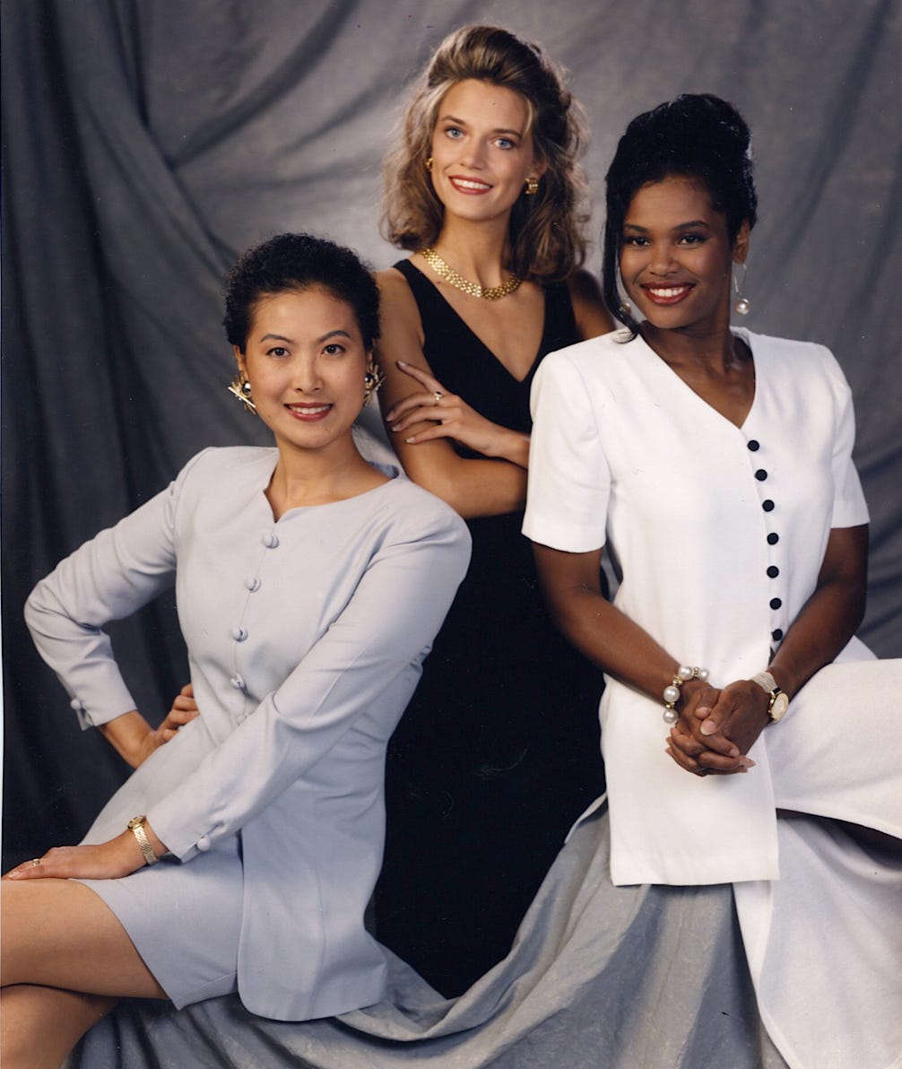
For the first half of the 1900s, Kodak held a monopoly on the photography industry, allowing it to influence film aesthetics. To ensure that the film was coloured within the company’s standards, Kodak created a tool called Shirley cards to establish consistency across skin tone imaging. The Shirley card portrayed an image of a porcelain-skinned, white woman named Shirley who conveniently worked at Kodak.
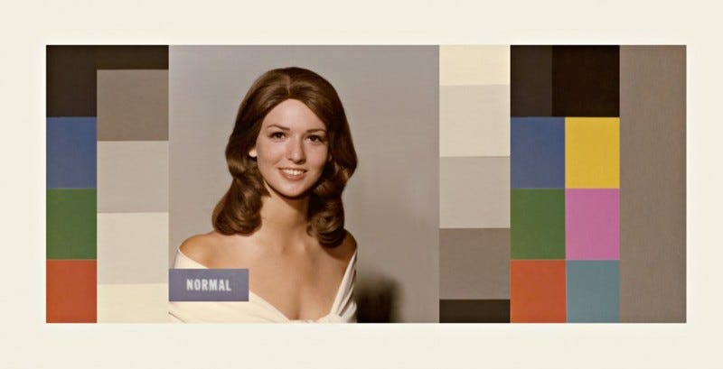
Shirley and her complexion became the rubric to measure skin tone in the development process and defined an aesthetic for what was deemed acceptable for skin colouring. A film developer would use the Shirley card to balance skin tones to match Shirley’s, leaving little direction on how to tone those with darker, redder and/or more tanned skin. As film technology advanced, the ability to capture a wide set of skin tones did not. This resulted in those with lighter skin being recognized as ‘easier’ to process while those with darker skin were regarded as ‘difficult’ and unphotogenic. Over decades, the original Shirley was replaced by different white women while the first models of colour did not appear on a card until 1996. Due to Kodak’s global monopoly, this cemented a racial bias for those with lighter skin tones in the photo development process, a bias that still lingers in imaging technology past the company’s eventual bankruptcy in 2012.
To combat this systemic racism, countless image-makers have framed a diverse set of subjects on their own terms, centering what they believe is beautiful while defining a new aesthetic. Photojournalists like Kwame Brathwaite, known for his prolific Black Is Beautiful portraits, captured blackness in America and beyond during the civil rights movement. More recently, visual artists like Andrew Thomas Huang, through gorgeous works like the short film Kiss of The Rabbit God, centre queer Asian intimacy with a palpable yearning that I haven’t witnessed since Kar-Wai Wong’s Happy Together. These image-makers represent a shift from an indoctrinated aesthetic and correct where inherited institutions have failed to vary our gaze. This signals less of a migration from a particular beauty and more of a journey towards a fury of beauties. The elimination of a standard aesthetic to make room for many.
As the aperture for what is beautiful continues to expand and contract, much like the zoom on my Pentax, our arrows collectively point towards realness. Whether it is a more truthful, comprehensive view of how we portray ourselves online or equitable imaging, we all want to be seen. And to be seen means to capture it all, whether it be beautiful or ugly, dirty or clean, curated or cluttered, much like the world we live in.




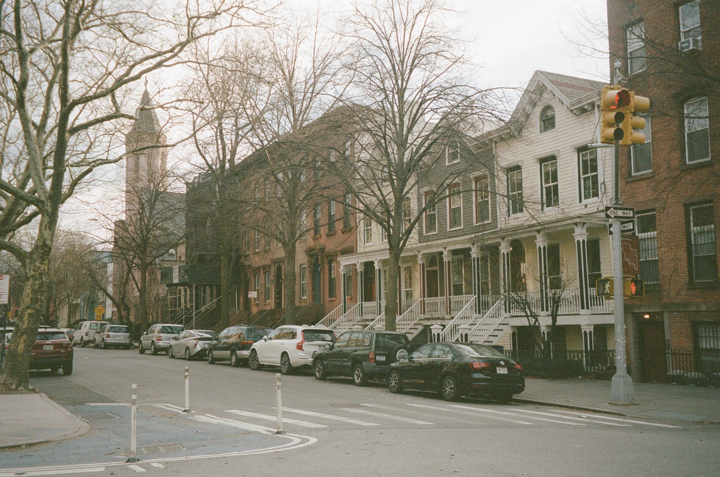
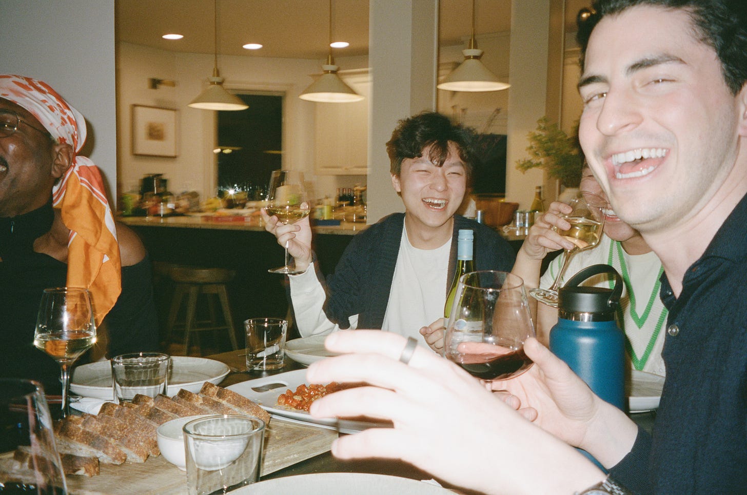

As someone who has never wished to aspire to the unrealistic airbrushed perfection of photography that started in the 80s and 90s I'm glad to see a more realistic aesthetic arrive.
I found this substack via a video review of this post on TikTok btw.